By Rob Capriccioso
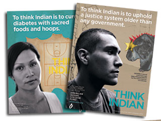
The campaign features several tribal college students amid vibrant images of their area of study. In hers, Two Bears appears beside bright re-creations of plant life and a small vignette about her tribal college experiences. Above her picture appear the words, “To think Indian is to save a plant that can save a people.”
AICF, a nonprofit based in Denver, has developed several similar print and television spots featuring tribal college students from across the nation. Its officials started the “Think Indian” campaign earlier this year in an effort to share how the unique cultural thinking of American Indians is being preserved at tribal colleges. At the same time, the campaign illustrates how the cultural landscape of tribal colleges is used by students to solve modern-day problems.
Tribal college students are combining Native cultural knowledge with modern business, science, and other studies to come up with solutions for modern diseases, preserving modern habitat, develop sustainable businesses and cities, and implement sustainable agricultural practices on this planet—and in space. Our students have the responsibility to preserve the Indian way of thinking for the next generations to solve age-old and modern problems. It is not only our students that benefit when you make a donation to the American Indian College Fund—the entire world is a better place thanks to Indian education.
Think Indian Print

My instant review of this campaign:
I love the "Think Indian" message. Naturally, since that's what I'm talking about when I promote a multicultural perspective. Don't look at problems only through American's dominant cowboy mentality. Consider the viewpoint of other cultures, especially indigenous cultures, as well.
"Think Indian" is a great slogan not only for the American Indian College Fund, but for any organization that promotes Native cultures and values. I'd love to see people adopt this slogan in general. For instance, Obama could use it as his theme when he speaks to tribal leaders at the Nov. 5 summit.
On the other hand...
But the black and white and pastel color scheme doesn't do anything for me. Perhaps the agency was trying to make the ads look "cool" or avoid Indian clichés, but this is one case where earth tones would work better.
And I'd say the "To think Indian is to..." taglines just miss the mark. They give an impression of the student's studies, but not a clear idea. Even when you enlarge the ads and look at them carefully, you can't quite figure out what the student is doing. Only by reading the website's explanations for the ads--which aren't part of the ads themselves--do you truly get it.
Take "To think Indian is to grow radishes on the moon." Is that a scientific, cultural, or artistic project? Is it a metaphor for something, or does the student actually plan to grow radishes on the moon?
The claim is so specific that it sounds suspicious. Is this one of those wasteful projects that Congress is always denouncing, like studying why people sneeze? What's next after growing radishes on the moon...growing red tomatoes on Mars? Iceberg lettuce on Pluto? Sunflowers on the sun?
I would've made the text more soaring and less specific. For instance:
This takes up more space than "grow radishes on the moon," but it suggests the relevance of Native values better. The student isn't just hoping to grow radishes on the moon, he's hoping to seed the stars. To me, this sweeping statement is more impressive. It tells readers more about why they should support Native values and the students who share them.
To sum it up, the ad campaign is a great idea, but the execution seems a little shaky. Let me know if you need more unsolicited advice, ad agencies!
For another ad campaign involving Indians, see Values.com's Jim Thorpe Billboard.

1 comment:
I've seen much worse. At least they use a decent font, have enough contrast between letters and background, and get the letters in the right order.
The last one seems obvious, but is not always the case now. Just a few years ago, a fall preview issue of "TV Guide" decided to "go to the edge", and they scrambled the order of letters in the show names (i.e. "Ugly Betty" would be "Guly Ebtty")
Post a Comment