A look at three illustrations for
The Indian in the Cupboard is instructive.

First we have the original book cover. A generic Indian is in the center. He's frozen in midstride, like a mannequin, a hard and lifeless object. He's displayed like a stuffed animal, trapped in a box, literally compartmentalized.
He's surrounded by a standard set of stereotypes. A
chief, a teepee, a bow and arrow, a cowboy. Both the Indian and the cowboy have their weapons ready. The cover suggests the story will be about cowboys vs. Indians, warfare on the Plains, Indians as surly
savages holding up the tide of progress.
Since I haven't read the book, I can't say for the sure if the contents match the cover. But the cover strongly suggests the Indian will be a stock character, one-dimensional, as interesting as a plastic toy. If this isn't Banks's view of her creatiion, she should've insisted on different art.
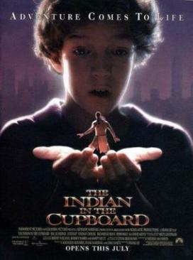
Here we have the original movie poster. On the plus side, the Indian is now a living being. The stereotypes are gone. It's clear the story will be about the relationship between the boy and the Indian.
On the minus side, the boy looms over the Indian like an all-powerful god. He's limned in light like an angel with a halo. His hands glow as if he's just given birth to a miracle. As if he's created the Indian out of clay or thin air.
The Indian looks startled or scared, as if he's meeting his maker. He's helpless, powerless, literally in the boy's hands. It's a perfect representation of the great white father looking down upon his poor little Indian. The cover couldn't imply more of a paternalistic, superior-to-inferior relationship if it tried.

Finally, presumably after critiques such as this one, we have a second movie poster. The Indian is now a full-fledged character, not simply a toy or a little person. He's joined by a cowboy with equal stature. So now the story isn't just about a boy and his Indian. It's about a boy and two men and their relationships as equals.
The poster still includes an image of the boy holding the Indian, but it's less significant now. The circle conveys the idea of magic (e.g., through the looking glass) as well as the angelic glow. What light there is appears to be shining onto the boy, not
from him.
Moreover, the Indian is larger than he was, making him more of an equal. The boy is more clearly gaping in wonder. Most important, the Indian is leaning forward as if to challenge the boy. No longer is he scared; rather, he's demanding to know what happened.
ConclusionArtistically, the second image is probably the best because it's so simple and striking. The third image is probably the worst because it's too cluttered with contrasting figures and colors. If I were designing a poster, I'd use the concept of third image but redo it entirely.
But the point here isn't to make the most artistic image. It's to show how you can package the same material in different ways. The creative choices can profoundly affect how you see and interpret the results.
Thematically speaking, there's no question the third image is the best. The first two images probably shouldn't have seen the light of day. But give the creative types credit for finally getting it right.
For more on the subject, see
Thoughts on Indian in the Cupboard and
Litefoot Dispels Stereotypes.