By Veronica Zaragovia
Rep. Bernie Hunhoff announced Thursday that he's sponsoring a bill aimed at adopting a flag design that would differ from the state's seal. It would still use the Texas' Lone Star flag as its inspiration.
Hunhoff says the Texas design is "a source of unity and pride."
"I believe a flag can do the same thing for South Dakota," he said.
Artist Dick Termes of Spearfish drew the design, which has a Native American medicine wheel surrounded by yellow rays of sunshine on a sky-blue background. He made the artwork at least 20 years ago.
Termes said he posted an image of the 23-year-old flag design on his Facebook page a few months ago. Since then, talk of a redesign has been resurrected.

New State Flag Doesn't Fly With Most
By Don Jorgensen
"It doesn't say South Dakota kind of boring and it looks like something from a video game," Autumn Remington said.
"At first glance it seems like avery religious type of symbol to me," Tye Ochsner said.
"I don't think it makes any statement about South Dakota at all it's just a damn sun shining in the sky, that don't mean anything to me, this means something to me," Don Runge said.
"I like the flag that we have I think represents South Dakota in a very positive way I think people when they see that flag they think of South Dakota, the new flag they won't really understand what it's about," Marie
But, some say the proposed flag stands out and has real meaning.
"Actually you know since there's such a strong native population in our state I'm not opposed to it this state has made good ground in relations with our Native American population withe the change of the name of Columbus Day, and I think this would be another great step," Glenn Williamson said.
Those positive comments are far and few between. Last night on KELOLAND News at five, we asked for your opinion on our KELOLAND News Facebook. More than a 100 of you responded, and just a handful of those comments were in favor of changing South Dakota's flag.
First, the present flag's design and color and design aren't bad. The main problem is the use of the state seal, which is hard to decipher and unoriginal.

The proposed flag has a few problems:
1) The so-called medicine wheel could be a Christian cross or a a kitchen sink drain. The whole point of a medicine wheel is its four colors and directions, so a solid orange wheel doesn't cut it.
2) The five colors--orange and yellow against three shades of blue--don't blend well. In fact, orange and blue is usually a terrible combination.
3) A bright sun and blue sky are totally generic. They don't suggest South Dakota in particular or anywhere else.
4) The design looks like something from a detergent box. That may be great in a supermarket, where you want your product to stand out. It's not great on a flag.

Rob's design
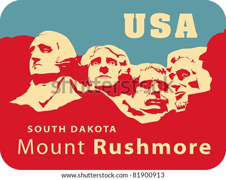
Something like this might work better:

Shift the image down, remove the words, and add a sun symbol in the upper left. You'd have an original and impressive flag that actually says "South Dakota."
Of course, Indians would protest the glorification of the dead white men and the theft of the Black Hills. So this design wouldn't fly for political and cultural reasons. But aesthetically speaking, I think this design is far superior to the others.
For more on Indians and flags, see US Should Fly Tribal Flags and Native Origin of Alaska's Flag.

1 comment:
For more on the subject, see:
http://64.38.12.138/News/2012/004888.asp
Native Sun News: Bill for new South Dakota flag stirs debate
Recently abandoned legislation supporting a new state flag has sparked a continuing tirade among South Dakota’s conventional, steadfast constituents.
The bill to adopt a less cumbersome, more streamlined design as the 21st-century version of the state’s official flag was killed before it ever really saw the light of day. Introduced during South Dakota’s 87th Legislative Session, Rep. Bernie Hunhoff (D-Yankton) was the bill’s main sponsor.
Post a Comment