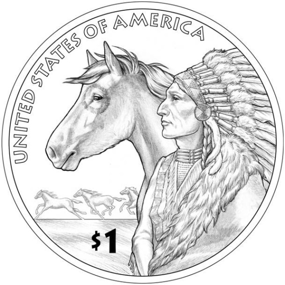
The mint said the new design for the reverse (tails side) is themed on "Trade Routes in the 17th Century", with the horse perhaps the most significant of all the goods traded throughout the continent during that period.
In keeping with the coin's theme, the image shows a Native American and horse in profile, with horses running in the background, representing the historical spread of the horse.
This trade received a massive infusion in 1680, when the Pueblo Revolt released thousands of horses from the mission herds into Native American hands.
The horse became perhaps the most sought-after commodity in inter-tribal trade.
The horse's spread in Native American hands was so prodigious that it became the primary means of transportation and the nucleus of the ranching economy already under way in the western territories.
In the south, the Caddo trade center became a major entry point for the horse. Trade up the Old Snake Route brought horses as far north as the Mandan in North Dakota, who supplied them to the Lakota and Blackfeet.
A parallel inter-mountain route brought horses to the northwest.
By the time Lewis and Clark wintered with the Mandan in 1803, they encountered a well-established horse culture.
Apparently the voters loved this design, and the mint went with the people's choice. As I said before, they were thinking of 19th-century stereotypes, not 17th-century history. The designs with ledger paintings, which were done in the 19th century, prove the point.
So the horse trade was a reason to feature the beloved chief of American history. In other words, it was basically an excuse to show off America's national mascot.
The design is okay if you ignore the figure of the chief. He looks goofy with his generic, almost Caucasian features and mink stole around his neck. This design would've been much better with a warrior who wasn't a chief.
For more on Indians and currency, see Chickasaw Quarter Debuts and 2012 Sacagawea Dollar Reverse Unveiled.


No comments:
Post a Comment