Students plan a petition campaign to erase American Indian face logo from athletic uniforms and gym floor, among other places.
High School principal Brian Ginter has promised that the American Indian emblem will not appear this school year on report cards, student IDs and student planners.
But it's not vanishing from the athletic department of the Warwick Warriors, the students were told.
So students plan to petition the school board. When school begins they will collect signatures and also send them to the state Department of Education, their leaders say.
The image used by Warwick High School depicts an American Indian with a brown or red face (depending on the particular image), aquiline nose and braided black hair.
"I don't know how they don't see that it's racist," says Matt Diabes, who graduated from Warwick in the spring.
For more on the subject, see Team Names and Mascots.
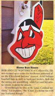
Below: Racist and stereotypical Chief Wahoo:

Stereotypical but not racist Warwick Warrior:


4 comments:
Writerfella here --
The emblem and logo of Anadarko, Oklahoma's high school is 'Warriors' with a similar Native profile. The emblem and logo of the nearby Riverside Indian School is 'Braves' with an almost identical Native profile. How do you choose which one is stereotypical? Or are they not or both? And who is going to tell either school as to what ostensibly is appropriate and what is not? Don't miss the next thrilling chapter of "MARAUDERS OF THE STEREO TYPIST" at this blogsite, next week!
All Best
Russ Bates
'writerfella'
I'd have to see both logos to be sure. But let's assume they're like the Warwick Warriors logo. If so, they're both stereotypical.
Why? A couple of reasons. One, they portray a traditional Indian who no longer exists. Two, they repeat the same elements seen in many other logos: the profile, the braids, the feathers. They're contributing to a cultural pattern that says "Indians look like this."
Often such logos are worse than the Warwick logo. They'll have reddish skin, an exaggerated nose, and a fierce look with a scowl. The Warwick logo is one of the milder ones, which is why I didn't criticize it too much.
Writerfella here --
Given the length of time that both logos have existed in this town, they will not be abandoned very soon. What will you do if they continue to exist? Tell Anadarko that they're off your Xmas card list?
All Best
Russ Bates
'writerfella'
What will I do? Continue to educate people as I've been doing since the 1990s.
For more on the subject, see Telling Indians What to Do.
Post a Comment