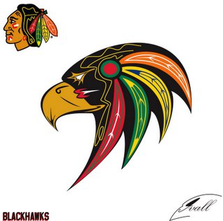
Wow. That's an impressive piece of graphic design. It retains all the significant aspects of the present logo, but does them one better.
It's hard to imagine anyone would prefer the bland, smiling Indian to the bold, dynamic raptor. A good test would be showing the two logos to people who aren't familiar with the Blackhawks. I wouldn't be surprised if they chose the bird over the human 10-1.
Jolene adds:
In fact one brilliant 6th grader said, "You know the Bears used to be the Cardinals then the Steel...." I was shocked he knew the history and made a connection that things can be changed very easily.
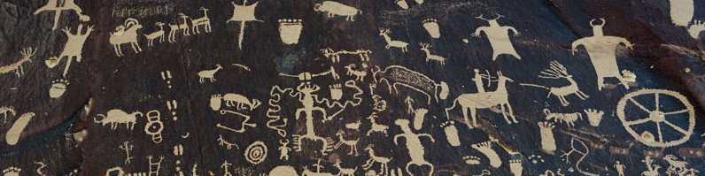
For more on the subject, see "Authentic" Chiefs from "Blackhawks" Tribe, Blackhawks Foe Waves Severed Head, and Blackhawks Know Nothing About Black Hawk.
8 comments:
Change the Blackhawk logo? Go ahead and try, you whiny little bitches. At your own peril, of course.
All of my grandparents were Swedish born; you don't see me whining about the Minnesota Vikings. I take pride in the logo as, I believe, should native Americans with the 'Hawks. Cleveland Indians, Washington Redskins well, maybe not so much. Atlanta Braves (may they forever post a losing record)- pride. Seminoles, Fighting Illainai, not sure. Fighting Irish, really not sure about that one either. But c'mon, the 'Hawks have, arguably, the best logo in sports!
Get your references correct. The Chicago Blackhawks are named after Chief Black Hawk of the Sauk tribe of Northern Illinois. He is the only individual in USA history to have a war named after him. The Chicago franchise of the NHL used his name (modified to one word) as a point of honor towards Black Hawk, and to all of the indigenous peoples of North America. So, remember the Blackhawks are not birds, but rather proud braves.
One thing no one seems to thing about, is a logo/mascot is a thing of pride. Native Americans should be as honored by the Blackhawks as those of Nordic decent are of the Vikings, or the Irish are of Notre Dame. No one names their team after something they hate, dispise, or intend to mock. The logo was chosen to represent the fierce will and determination shown by this country's proud indigenous people. To say its offensive to Native Americans is offensive to common sense.
It's a suggestion, Anonymous #1, not something anyone's going to impose on you. So grow up and get over it. With your juvenile threat, you're the only one bitching here.
For more responses to these foolish comments, see:
Blackhawks fans defend stereotypical logo
P.S. Vikings no longer exist, Anonymous #2. Neither do Trojans or Spartans.
If they did exist, they wouldn't be a historically oppressed group whose existence is mocked and scorned by stereotypes. Unlike Native Americans.
Find me some Vikings who object to the depiction of their people and then we'll talk. Until then, your point is irrelevant.
Not true, it was the McLaughlin's infantry division in world war 1, the "Blackhawk Division"
Post a Comment