NICE!!! =o)
Very IMPRESSIVE!! I can't wait for you to work on my tattoo!!
Keeps us posted on the progress! Congratulations!!
Very nice work man!!!

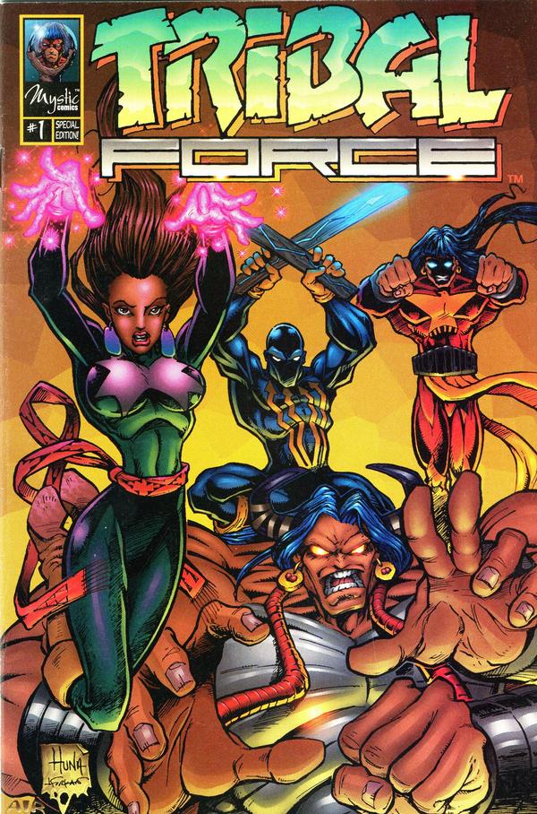
Comment: Hmm. My thoughts were more along the lines of: Too busy. Hard to discern the figures. Needs work. Not ready to be published.
If it isn't obvious, I think the figure in the middle is supposed to be a super-skateboarder. The figure in the upper right has four arms, two in shadow. In the lower right are three light figures and two dark ones--perhaps villains. In the lower left is a Raven mask--perhaps a hero or a spirit guide for the heroes.
Will this cover be in color? Few people publish comics with black-and-white covers these days. But the black silhouettes and shapes suggest this may be it.
In contrast to the new TRIBAL FORCE cover, the old TRIBAL FORCE cover stands out. It's still too busy--especially the figure in the lower half--but it's vibrant. It appeals to the eyes.
The new logo is a step down too. It looks hand-drawn and squished. Unless he didn't own the rights to the old logo, I don't know why Proudstar would switch.
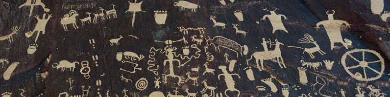
For more on the subject, see TRIBAL FORCE in Progress and Comic Books Featuring Indians.
5 comments:
Those must be up there with the weirdest breasts I have ever seen...
Yes. But it's common in comics to give women hyper-inflated breasts.
The second one is a lot better. The first one made a major blunder in covering up part of the logo. "Tribal Orc" indeed.
Nice cover.
Which cover is "nice," Anonymous?
Covering up a logo with art is often done, DMarks. But it's a mistake to do it on your first issue, when nobody knows what the title is.
Post a Comment