Designing Fulcrum’s Book Covers: An Inside Look at the ‘Trickster’ Cover Process
How the
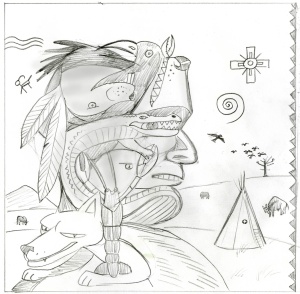
Trickster graphic novel went from this
proposed cover:
 MATT DEMBICKI, Author/Editor: The initial cover was designed and illustrated by Peter Kuper (Spy v. Spy, World War III), who is well known for using stencils and spray paint to render his illustrations. I asked Peter if he would be interested in illustrating one of the stories for the book, but his schedule was full at the time. He did say he could do a cover, though. Getting the right image for the cover was going to be a challenge. I told Peter about the various trickster beings in the book—coyote, rabbit, crayfish, etc. I didn’t want just a coyote or rabbit on the cover; I wanted something that would convey that this is a collection of a range of trickster beings. Peter took that and crafted a wonderful image, combining all those animals in an ingenious way to create another image. Although the illustration was wonderful, it was a little tight in terms of adding title text and such, and there wasn’t much room for a bleed area.
To the final cover:
 MATT: I hated to let the Kuper cover go, but I agreed that this was the better image, given the circumstances. Any lingering doubts were quashed when I was at Book Expo America 2010, where the book debuted. Several folks stopped by the Fulcrum booth to thumb through the book simply because they were drawn in by the cover.
Comment: For more on the subject, see
"2011 Notable Children's Books" and
Dembicki Explains Trickster's Origin.


No comments:
Post a Comment